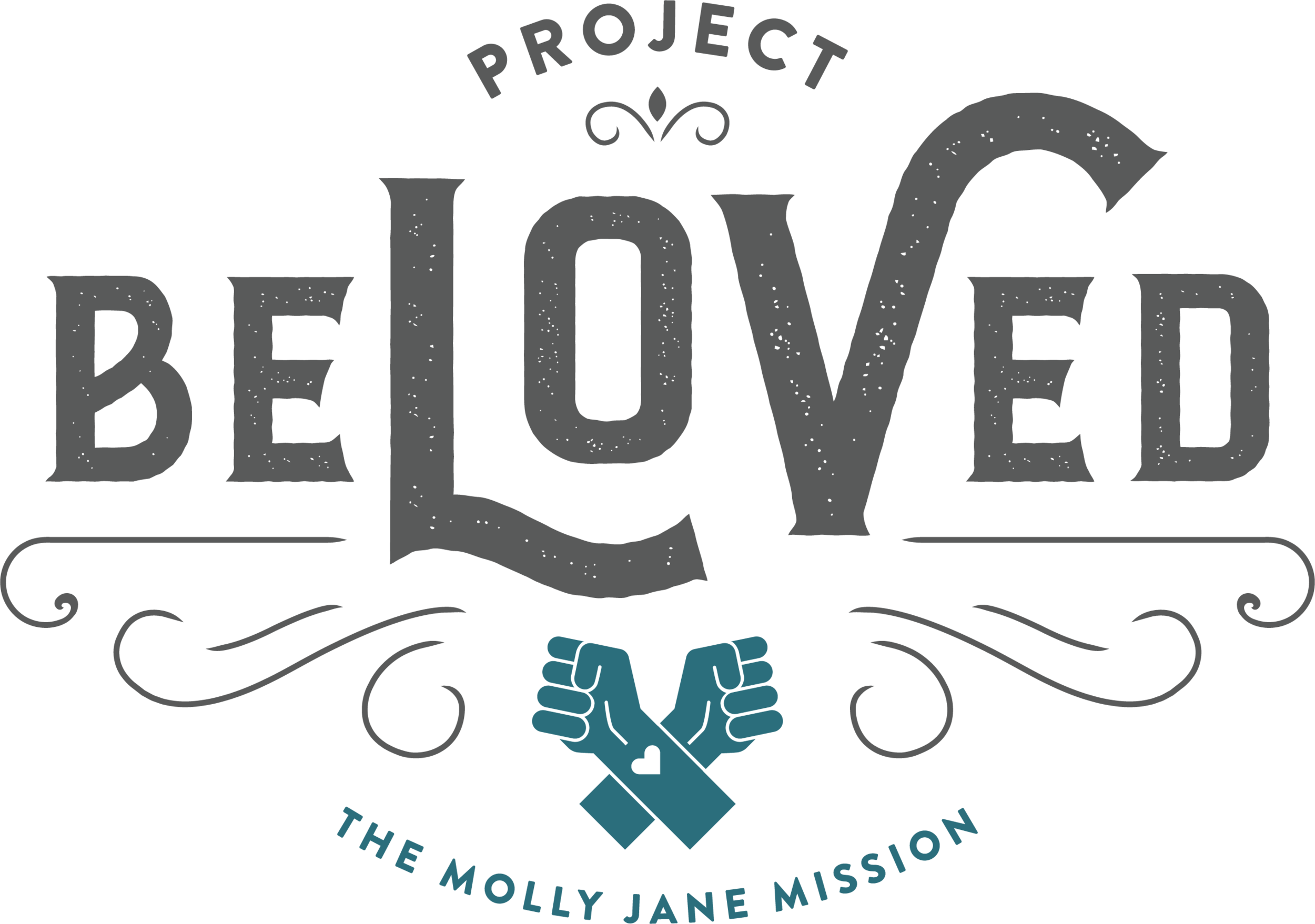
Logo Defined
by graphic designer, Morgan
1. I wanted the mark to feel strong. Really strong. I didn't know Molly very well, but I understand that she was quite the force of nature. I also think what you're doing is about empowering others, so strength and courage seem like guiding principles for the project. You can really see the strength of the mark through the heavy typography (especially in the word "Beloved") and the use of the fist as an iconic piece.
2. I wanted the mark to feel feminine. Again, knowing Molly through your stories, she seemed like she was super fun and flirty. I also know that your audience will be geared towards women, so that's another reason why I wanted to show a softer side with the the use of flourishes and organic shapes.
3. The fists. I wanted to incorporate something with a right hand because I know that's what you call your Molly Jane and I just love that. So, I have fists with the right hand on top and a heart on the spot where you got your tattoo. These represent your relationship with Molly and the coming together of women to support each other. ALSO (and this may be my favorite part) bringing crossed fists to your chest represents the word "Beloved" in American Sign Language.

